ZEISS customer portal
Creativity in design of myZEISS product as independent contributor
Building ‘download and maintenance’ sections, advocating design changes,
inspire others, communicating decisions to interdisciplinary teamsImprovement of user experience and processes, speeding up maintenance
of machines by letting users manage multiple needs on their own
What is ZEISS?
ZEISS specializes in optical and optoelectronic technology. It is known for its production of a wide range of optical products, including cameras, binoculars, microscopes, and medical devices.
One of the significant contributions of ZEISS to the field of optics is its high-quality lenses and optics. ZEISS lenses are renowned for their clarity, precision, and innovation, and they are commonly used in various applications, from photography and cinematography to scientific research and medical imaging.
In addition to optics, ZEISS is involved in other areas such as semiconductor manufacturing, industrial metrology, and medical technology. The company has a global presence and has established itself as a leader in the optics and optoelectronics industry.
Customer portal
Let’s focus on the business clients of ZEISS. They are using all these complex machines, operating through the software delivered by ZEISS. However, since most of the machines are offline, each time they want to update, authenticate or solve the problem, they needed to contact ZEISS in person. What would happen if - at least some of it - could be done automatically, online? Through some sort of access page?
That’s how the idea of ZEISS customer portal was born. To make everyones life easier.
My role
concept & final design of the software & machine sections
expanding & upgrading the current design system
working closely with devs and product owners
testing with real users (weekly basis)
stakeholder presentations (biweekly)
ZEISS provides several different application to make their machines come to life. Unfortunately none of these had any branding, even icons were outdated, following the glassy/drop shadow style (but who knows, trends like to go in circles). So the first part was to add at least an idea how these might be refreshed.
Plain style icons + cosmic images among other ideas met the best reviews, therefore it stayed as a placeholder.
Another challenge was lack of patterns allowing collapse/expand behaviors - and somehow, during many attempts and tests we decided these are mandatory to bring our solution to life.
Outcome
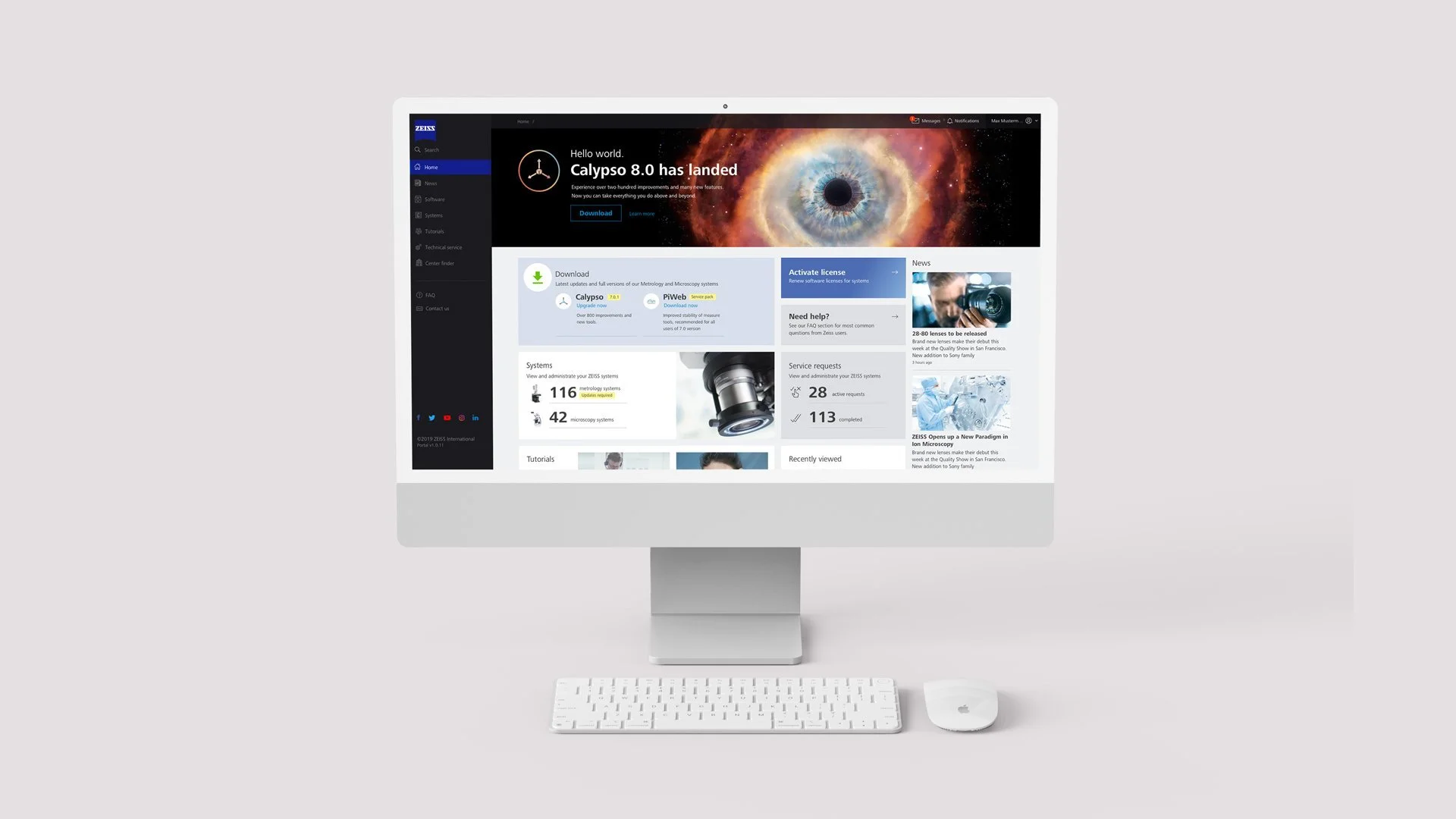
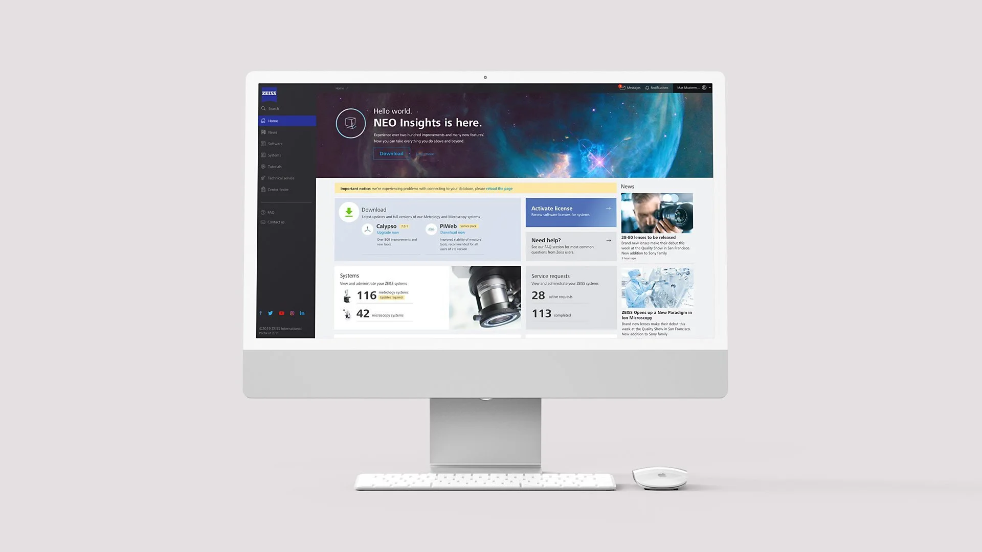
First thing accepted and implemented was the dashboard. It consists of variety of modules of which some are call to actions, some informal and others educational/announcements. The main area is occupied by the promo section - in this particular example, it’s the NEO Insights new release. Underneath we have a “update” panel, shortcut to Activate license process, as well as summary of how many machines we own or how many service requests are currently active.
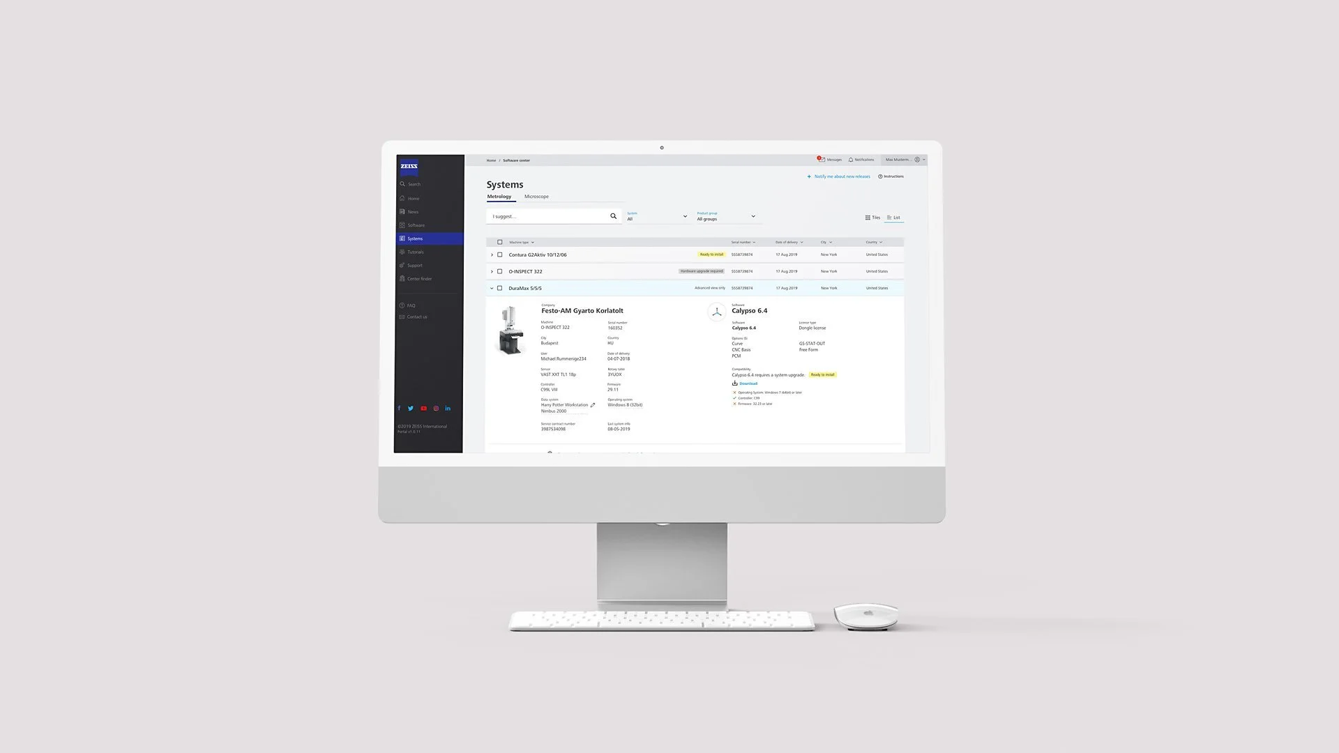
“Systems” section is a list of expandable rows, user can view all the details as well as doing self-maintenance.
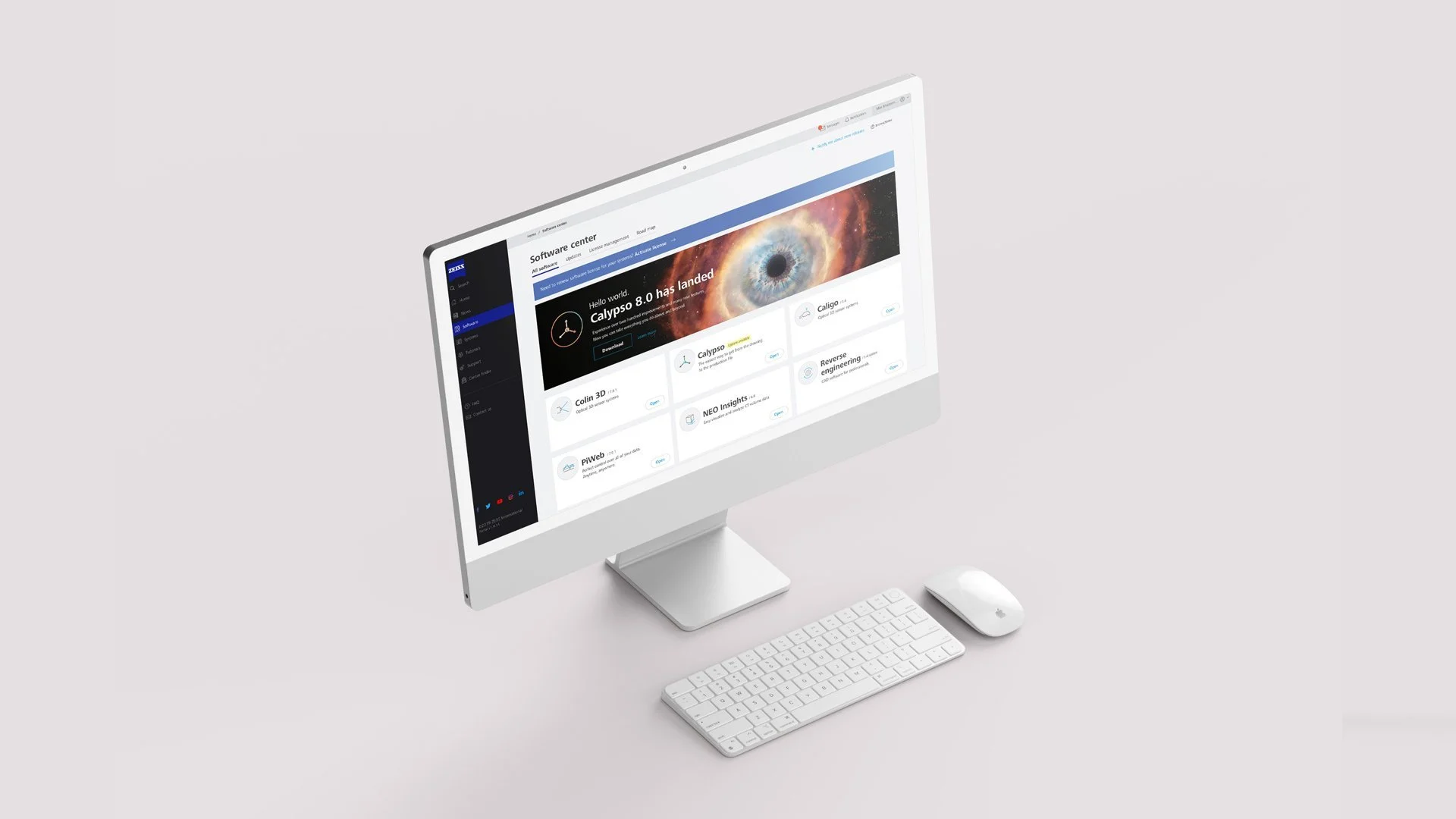
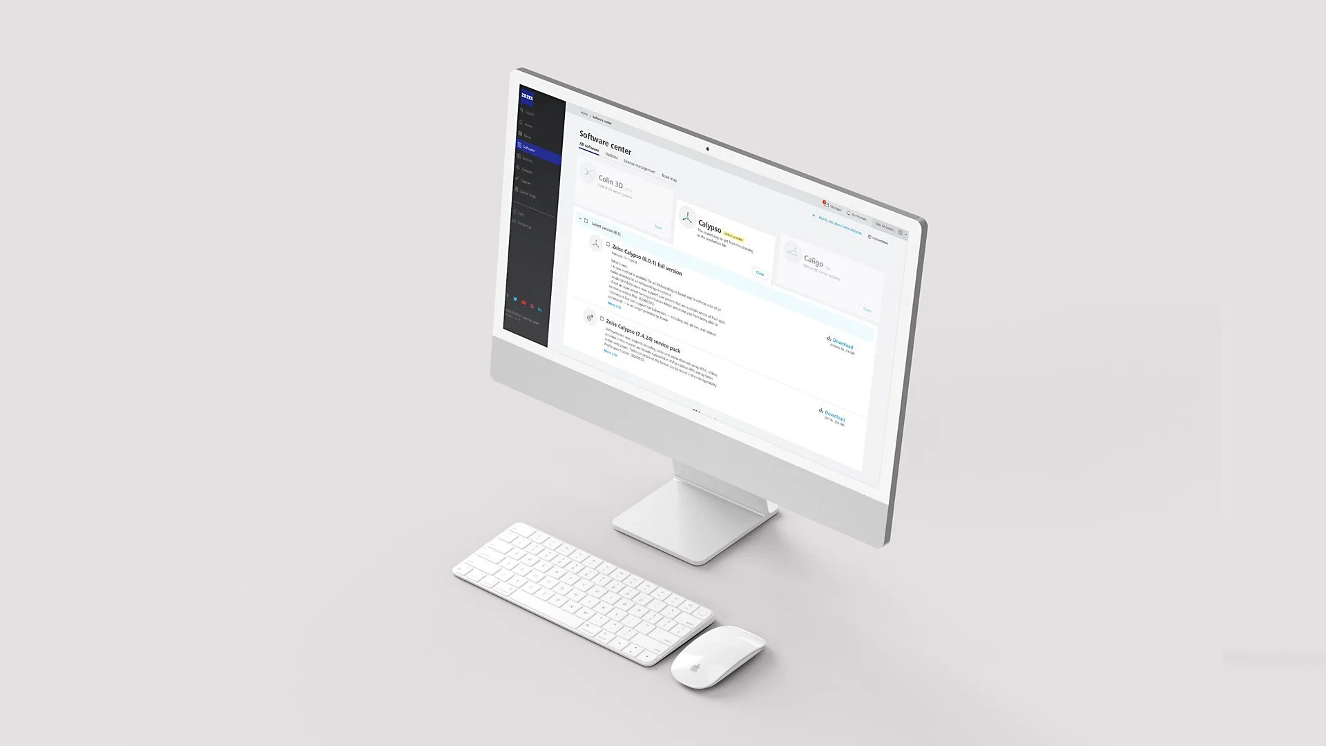
Software was organized into tiles - user can see at once every major application available. On clicking, the tile expands, diminishing the rest of the blocks. This solution helps checking the details while keeping the context.
For any “act now” scenarios simple blue alert module appears.
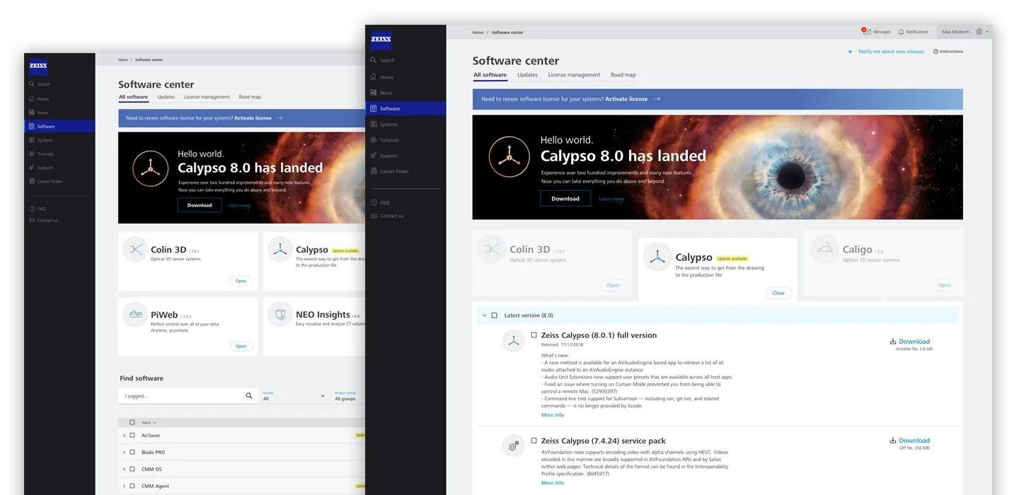
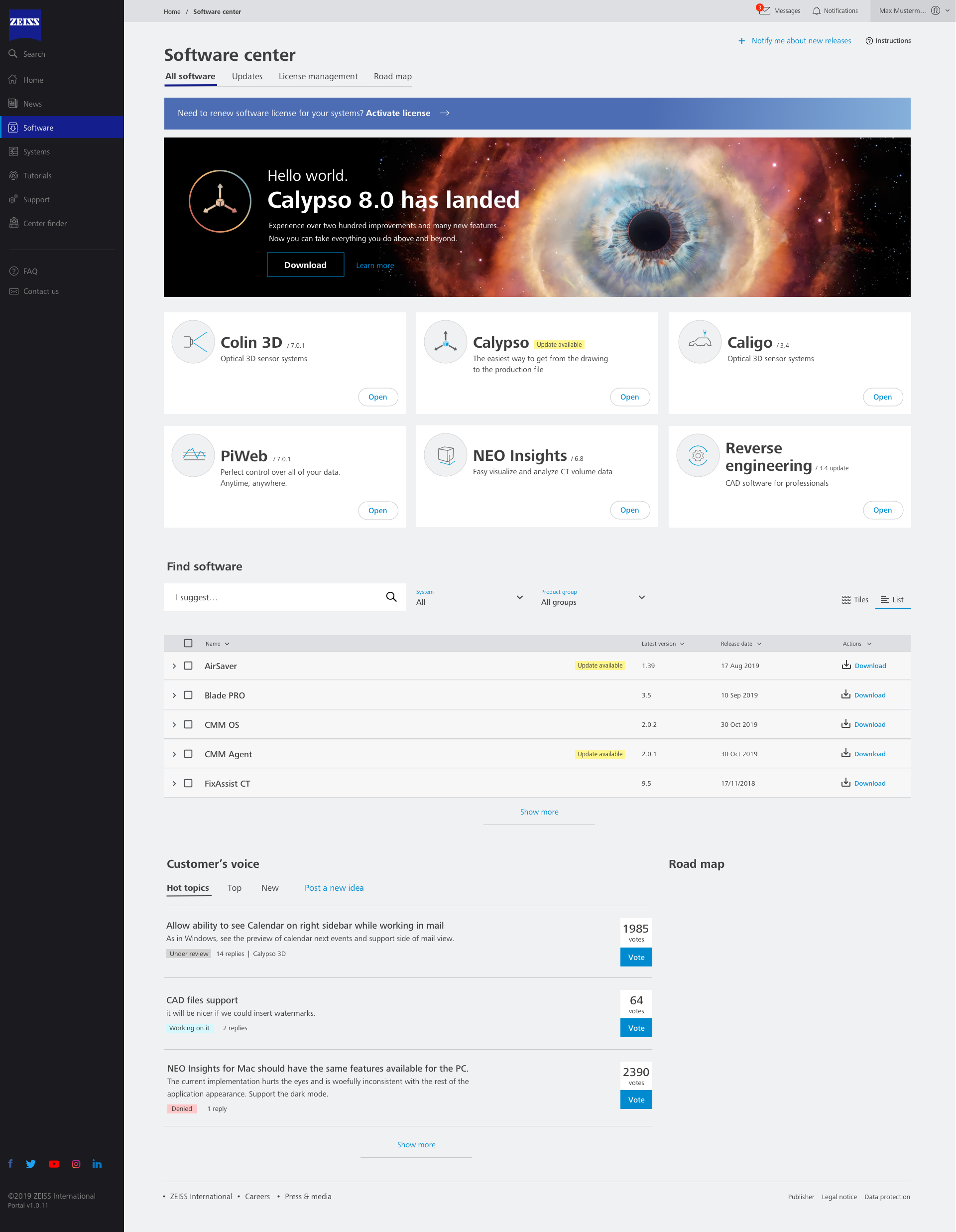
Software section, tiles collapsed.